

Client | Designlab
Role | UX/UI Designer
Duration | 4 Weeks
Tools Used | Figma, Illustrator, Photoshop, Marvel
Role | UX/UI Designer
Duration | 4 Weeks
Tools Used | Figma, Illustrator, Photoshop, Marvel
The Story Behind the Project
I took up this project to understand the design process behind healthcare apps and how a designer can navigate delicate and sensitive topics surrounding healthcare apps. This project helped me understand the true meaning of empathic designs as researching and understanding more about a medical condition, allowed me to step into the shoes of someone who suffers from the same in order to try and create a solution that aids in their day-to-day routines.
Problem Statement
India is home to over 60 million adults with diabetes (7.8% of the population), of which more than 30 million are undiagnosed or untreated, thus increasing the risk of developing complications and premature mortality. Diabetes is a disease that occurs when your blood glucose, also called blood sugar, is too high. Blood glucose is your main source of energy and comes from the food you eat. Insulin, a hormone made by the pancreas, helps glucose from food get into your cells to be used for energy. Sometimes your body doesn’t make enough—or any—insulin or doesn’t use insulin well. Glucose then stays in your blood and doesn’t reach your cells. This results in symptoms, including increased thirst and urination, increased hunger, fatigue, blurred vision, numbness or tingling in the feet or hands, sores that do not heal, unexplained weight loss.
In light of this development and rampant increase of the condition, more and more companies are investing in closing the gap between blood glucose tracking devices and diabetes tracking apps. This project aims to create an app that helps a patient track their condition, symptoms and also progress with ease.
In light of this development and rampant increase of the condition, more and more companies are investing in closing the gap between blood glucose tracking devices and diabetes tracking apps. This project aims to create an app that helps a patient track their condition, symptoms and also progress with ease.
Project Goals
● Design of an iOS mobile app that helps users monitor and manage their diabetes. The app should be in line with Human Interface Guidelines and other iOS apps
● Design of the overall branding for the company
● Design of the overall branding for the company
Stage 1 | Understanding Diabetes
Topic Research | Learning more about the condition
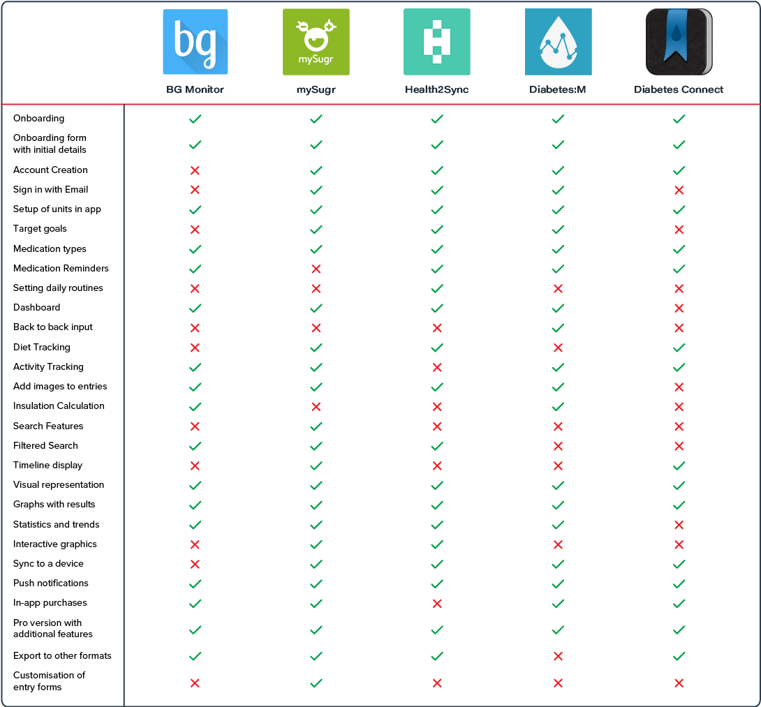
Since I had very little knowledge of Diabetes and certainly not enough to create a well rounded app, I started by conducting a Topic Research to learn more about the basics of the condition through online resources. I then proceeded to conduct a Competitor Analysis of the various diabetes tracking apps in the market and the features that they offered. This helped me understand the variables used to track and monitor diabetes.
I also conducted an Expert Interview with an Endocrinologist to understand the condition from an experts POV and to gain insight into how to tackle it. The expert also helped me understand how the condition affects people on a day to day basis and the various techniques that could be employed to remedy it.
I also conducted an Expert Interview with an Endocrinologist to understand the condition from an experts POV and to gain insight into how to tackle it. The expert also helped me understand how the condition affects people on a day to day basis and the various techniques that could be employed to remedy it.
Primary Research | Learning from Diabetics themselves
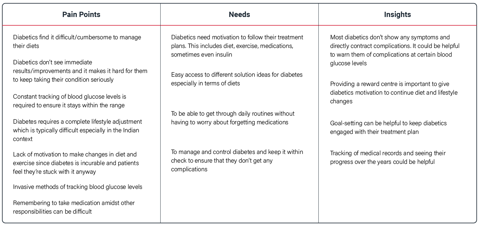
Upon conducting interviews with 5 different interviews of which 3 were diabetics and 2 were caregivers to diabetics I compiled the Interview Findings, and achieved a deeper, more empathic understanding of the condition and the processes diabetics follow to manage their condition. I also understood the pain points directly from the users themselves. I compiled all my findings in an overall Research Synthesis which allowed me to outline the key findings.
Key Research Findings
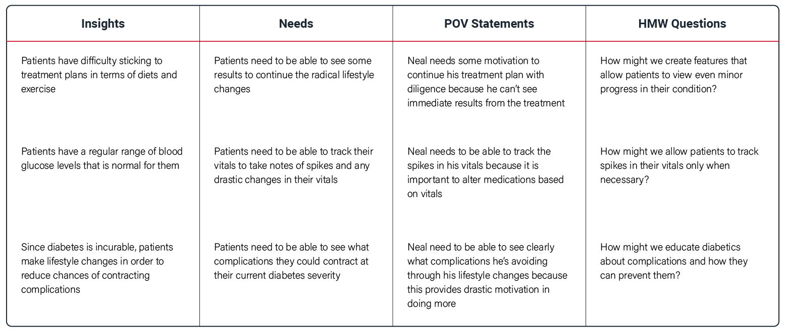
Synthesising Findings into POV and How Might We Statements
Stage 2 | Defining the Foundation
Outlining the Target Group | User Persona, Empathy Map and Customer Journey Map
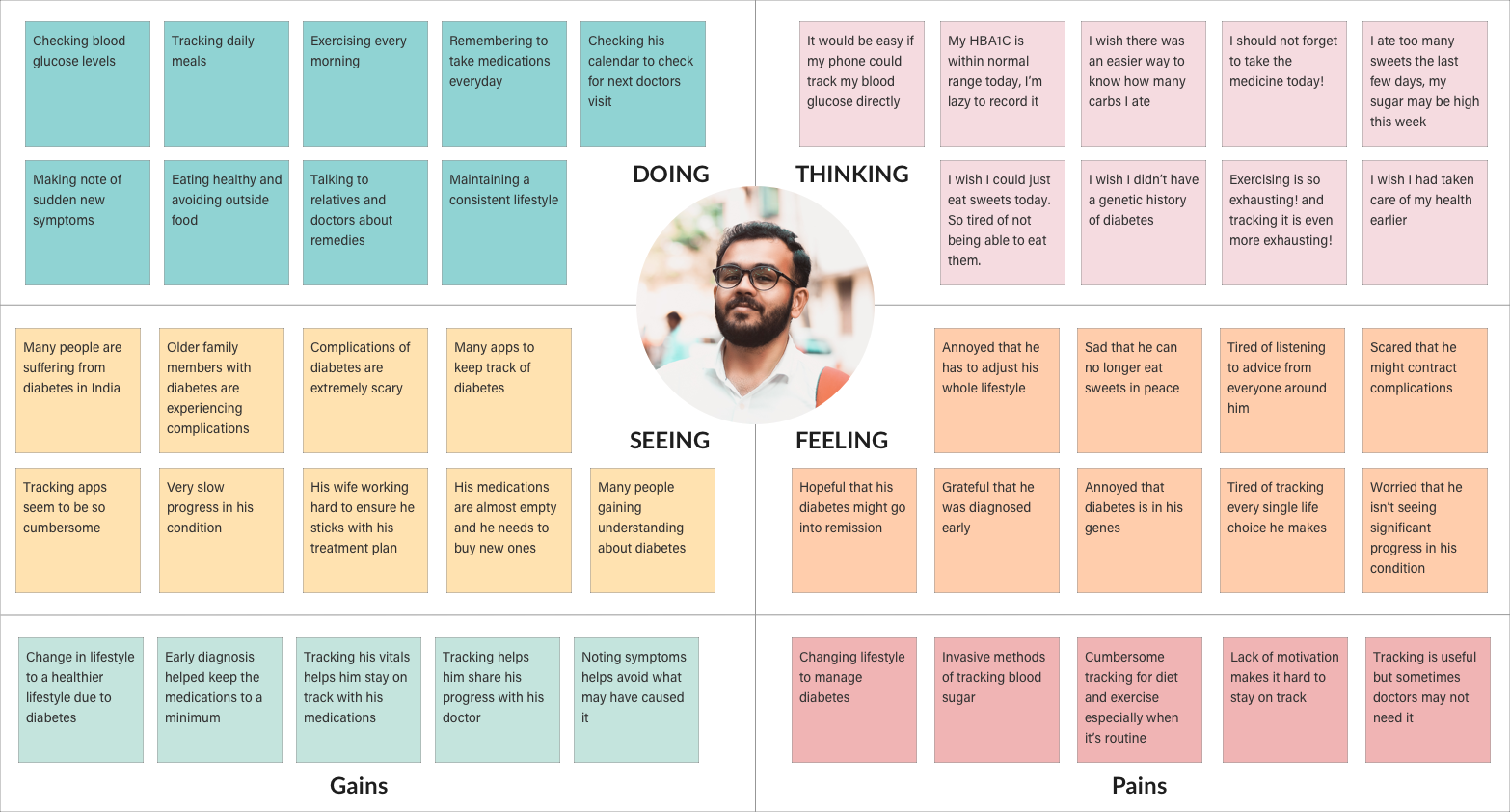
The research synthesis helped me understand potential users and enabled me to outline user personas and empathy maps that helped guide me in the design process. This persona symbolises the primary target group and helped me maintain direction in my process. The creation of empathy map for the persona helped identify pain points and in empathising with potential users. The customer journey map also outlined the emotions encountered by a person diagnosed with diabetes.


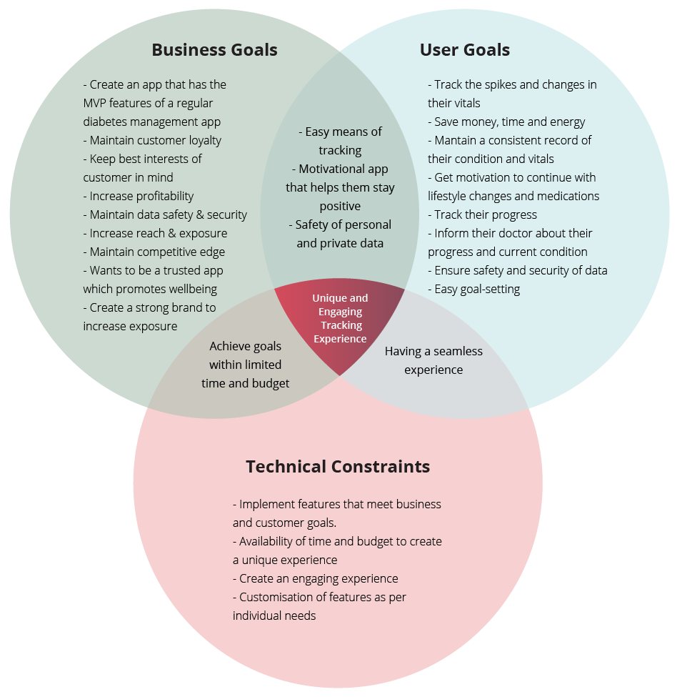
Defining Project Goals | Finding the Best Solution
The empathise stage helped provide the framework to define the project goals which helped strike a balance between business, user and technical goals. This step brought clarity in the design process and helped connect the research to the process of design. On defining the project goals, I prioritised the various features required in the product and worked out the features necessary for an MVP in a Product Feature Roadmap
Information Architecture
Based on the research synthesis, POV and HMW statements, a complete Information Architecture upto section level of the app was created to achieve a seamless experience.
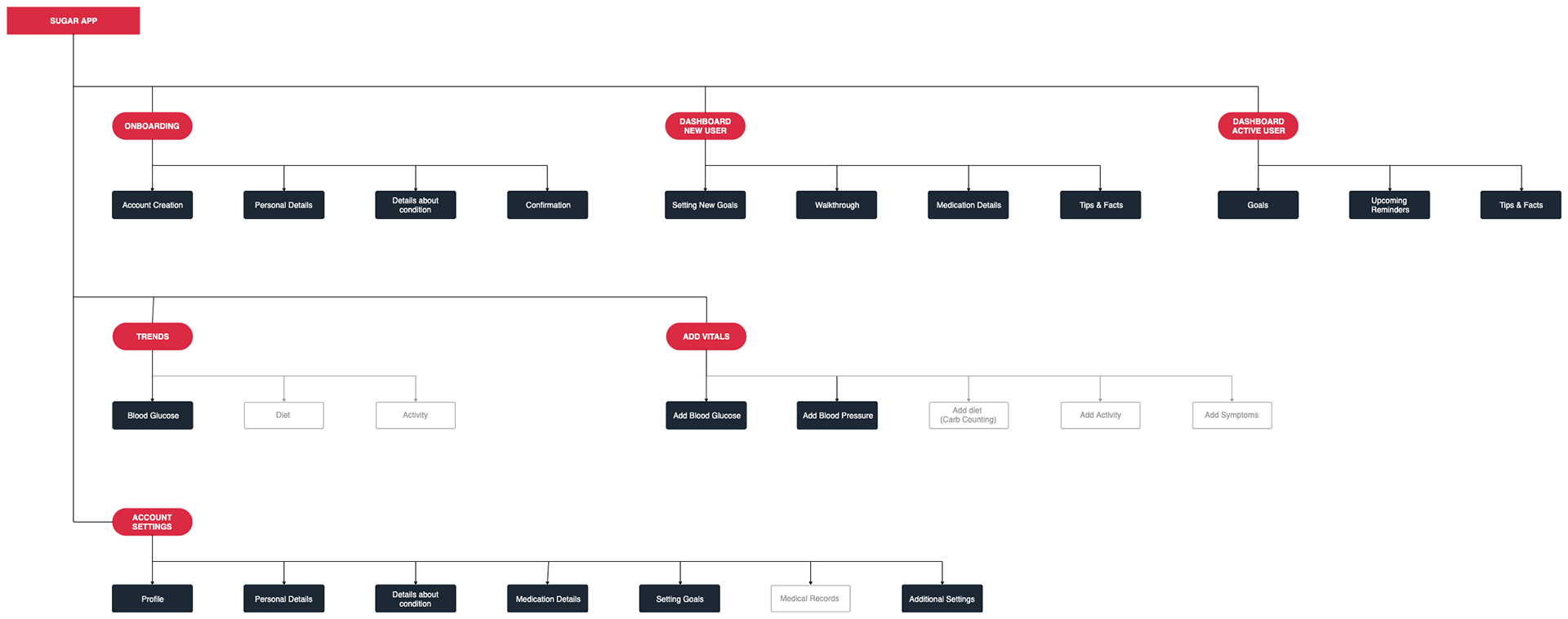
Sitemap
Stage 3 | Conceptualising
Wireframes
The ideate stage started with sketching out ideas and wireframes based on the findings from the research and define stages. Sketching helped in quick explorations of multiple different design solutions. My goal was to create minimal designs that would be easy to navigate considering that the data requirements for the app were quite heavy.
Once the basic wireframes were laid out through sketching, these were converted into low fidelity wireframes where focus was given on functionality and overall layout of the pages.
Once the basic wireframes were laid out through sketching, these were converted into low fidelity wireframes where focus was given on functionality and overall layout of the pages.


Mid-fidelity Wireframes
Mid-Fidelity Wireframes
Stage 4 | Testing with the Users
Usability Testing and Findings
Upon completion of the mid-fidelity prototype, the design was tested on potential users. I tested the prototype with 5 users with primarily positive results. The findings for the same are compiled in the Usability Test Findings. As per the tests, the users were delighted by the features and didn't face any problems with the features themselves rather faced some issues due to the limitations of the prototype. Some users had some trouble navigating around the app which I then resolved in the high priority revisions.
Stage 5 | Creating the Final Designs
Branding
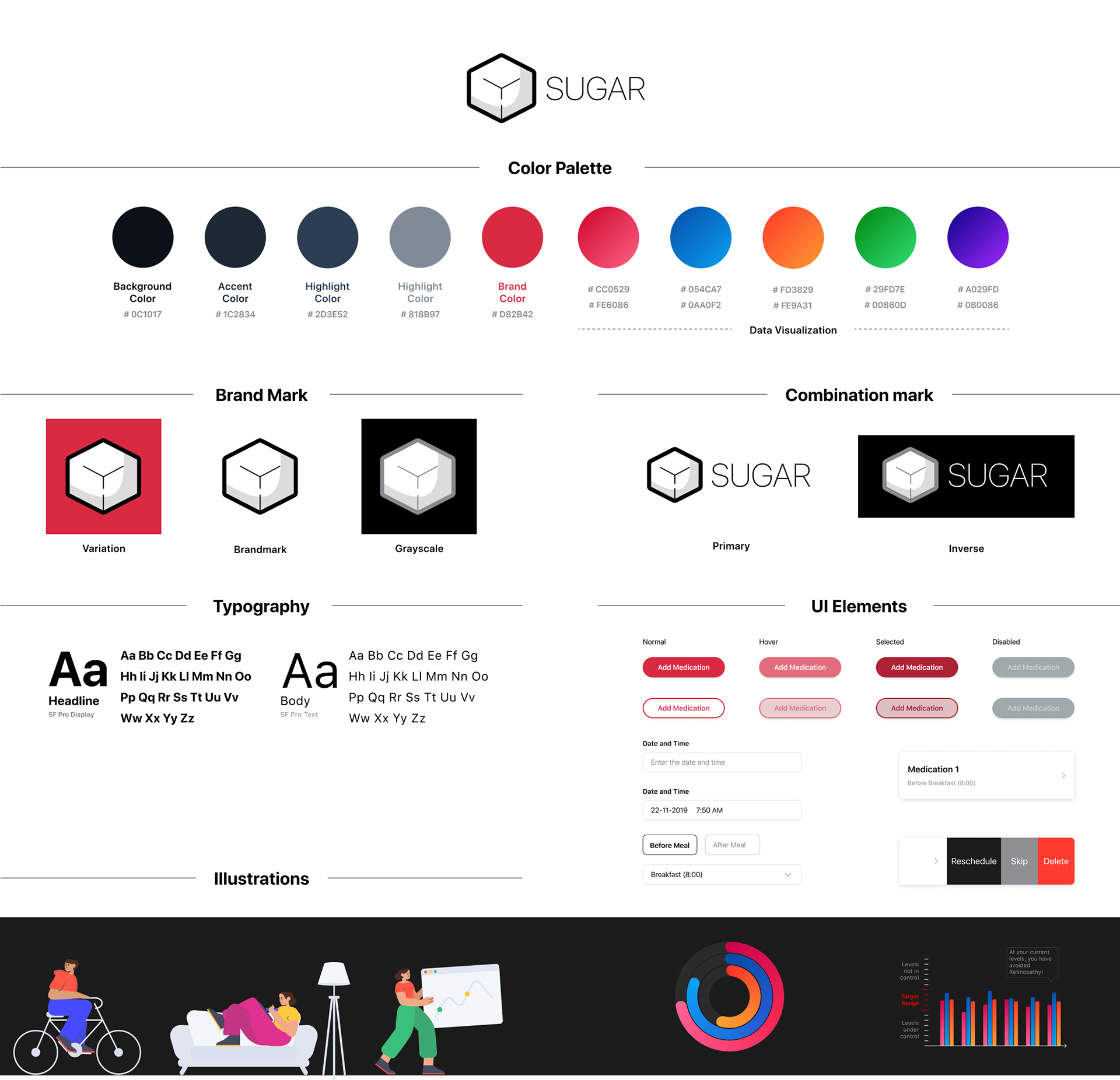
I chose the name "Sugar" for the brand as this app aims to redefine how diabetics feel about the word 'sugar'. In addition to this, it is common to hear someone say "Check your Sugar" to a diabetic. The referencing that the word Sugar has to Diabetes is quite strong and this is what I wanted to build the brand around.
The colors were decided upon to maintain the minimalism of the app and to allow the important sections to stand out such as the progress towards goals, trends and graphs.
Illustrations for the on-boarding process provides a break in the seriousness of the app and helps users feel at ease. These illustrations were by courtesy of Smash Illustrations.
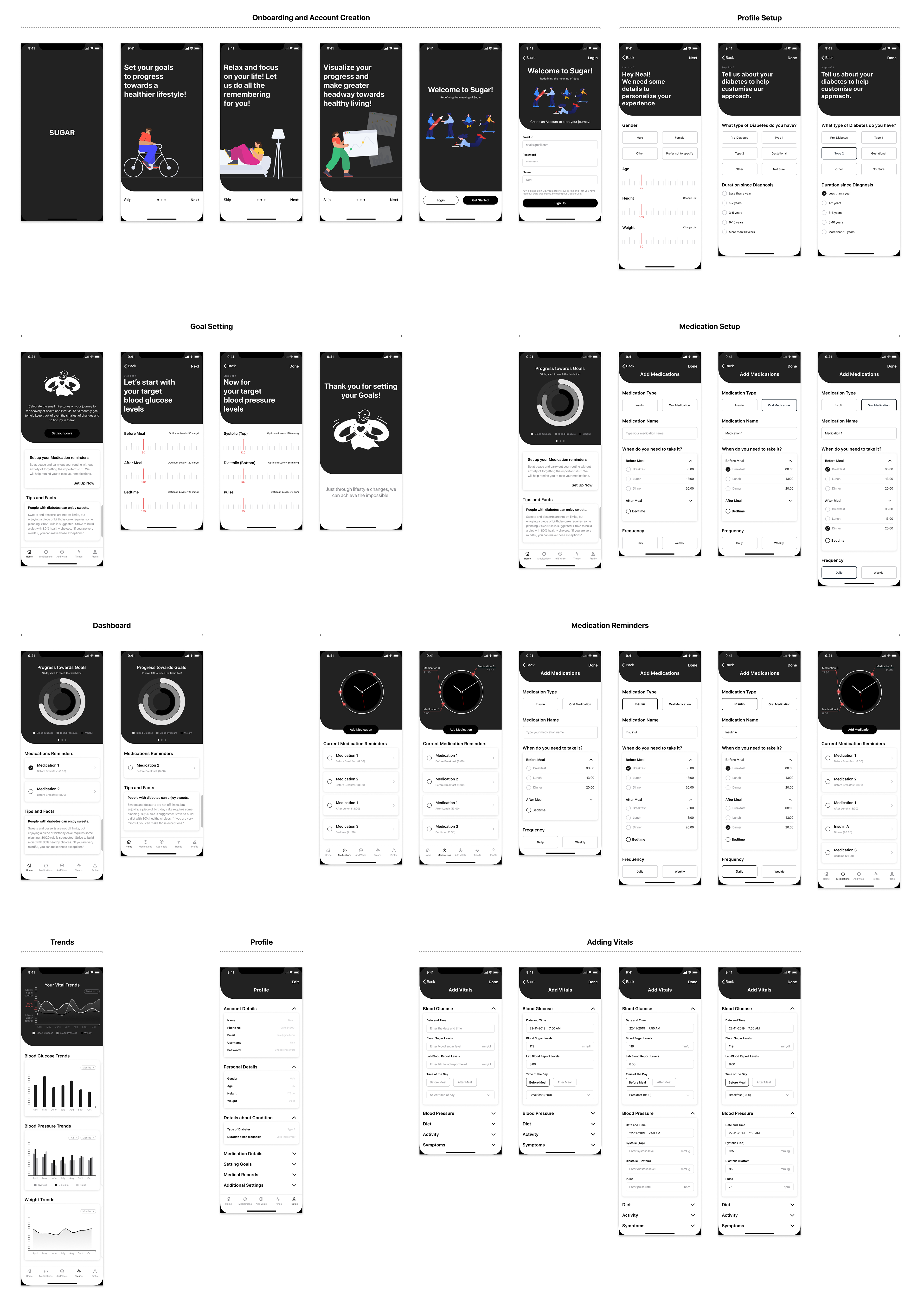
High-Fidelity Wireframes and Prototyping
The high-fidelity wireframes were designed based on the branding and usability test findings. I wanted to try and achieve a very minimal UI wherein the users are able to quickly focus on the most important features. The usability test revealed certain flaws in the app which were then revised for the final wireframes.
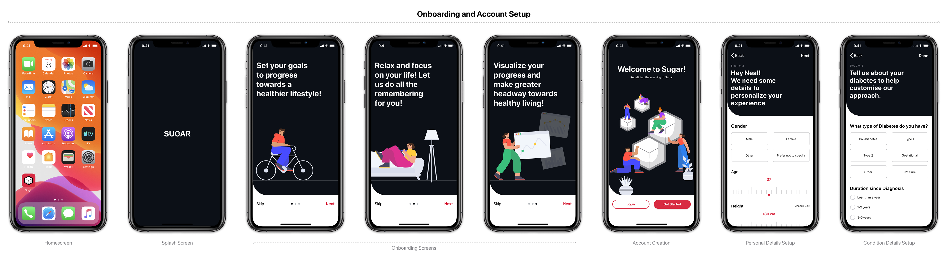
Onboarding and Account Setup: The on-boarding flow slowly guides the user towards the account creation. I started by drawing focus on the key features of the app and then asking the user to create an account to begin. The illustrations in the on-boarding brings a sense of lightness and breaks the serious nature of the app. Upon account creation, the user is asked to input some basic details using sliders and buttons that will help setup their profile.
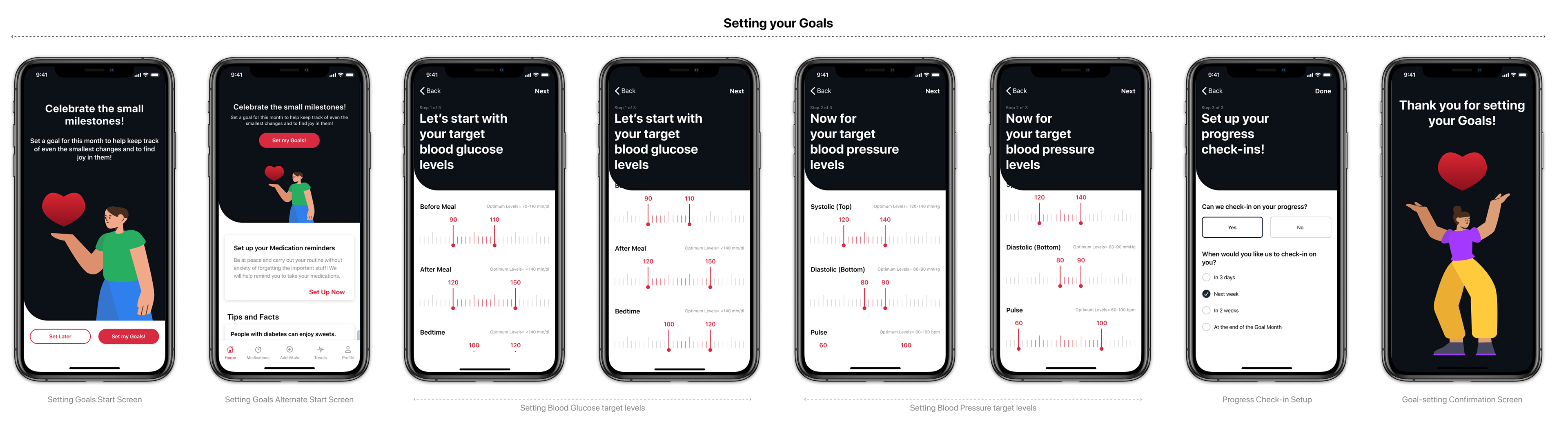
Setting your Goals: The setting goals page follows the initial profile setup, urging users to set goals that they can then achieve. The main purpose for setting goals on a monthly basis is to encourage users to celebrate the small victories and achievements. This is an extremely important step in a slow progressing disease such as diabetes. This flow requires users to primarily set their target level ranges for blood glucose and blood pressure. The app also allows users to define when the app should remind them to check-in with their progress in order to remain consistent.
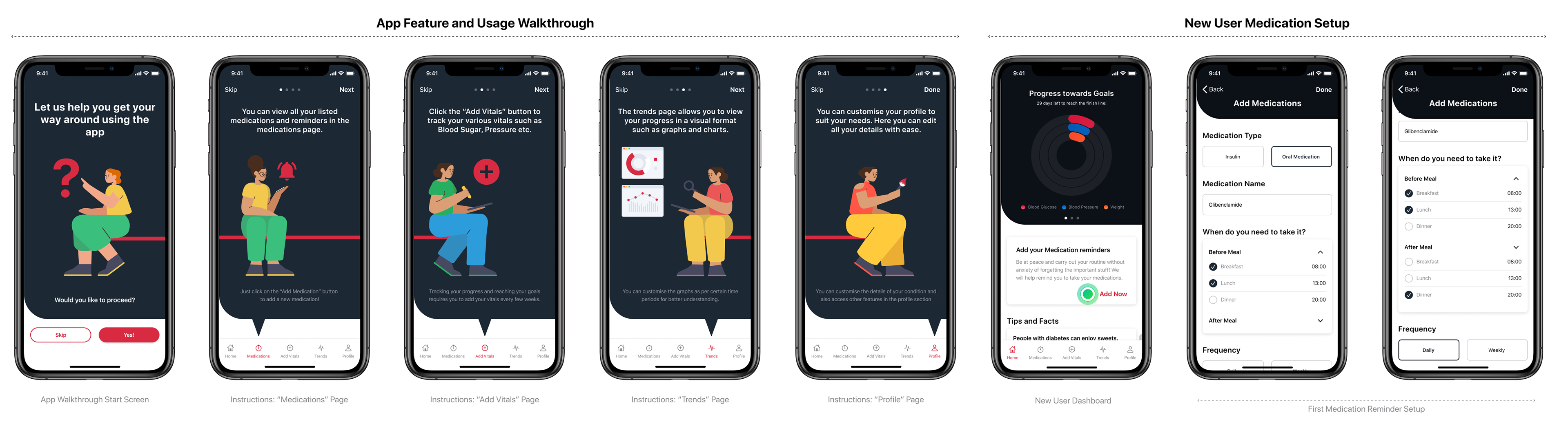
App feature Walkthrough: Since the app is relatively of a technical nature, I included a walkthrough of the app features based on the usability test findings. This walkthrough guides new users on the main features and pages and guides them on the usage of the navigation bar to access the same. The walkthrough follows a similar style as the initial on-boarding to bring about seamlessness.
New User Medication Setup: Upon completing the walkthrough, a user lands on their dashboard wherein they will be urged to setup their medication reminders. Here they can specify their medication and the timings they need to consume the same.
New User Medication Setup: Upon completing the walkthrough, a user lands on their dashboard wherein they will be urged to setup their medication reminders. Here they can specify their medication and the timings they need to consume the same.
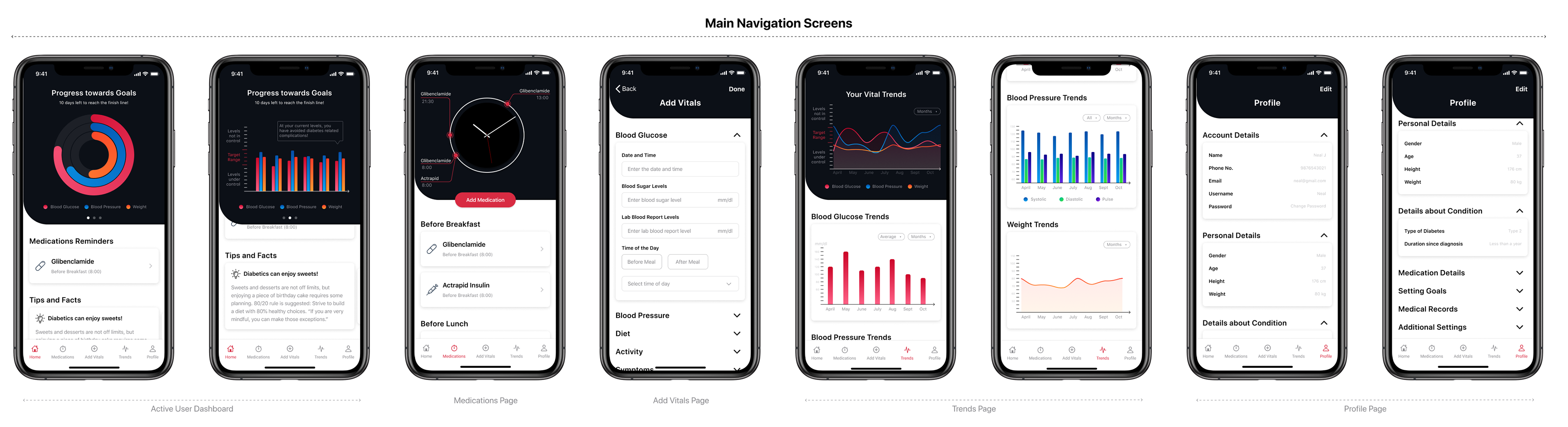
Main Navigation Screens: The static navigation tab allows users to access the main screens of the app. The dashboard gives users an overview of their progress in a visual format. It also shows upcoming medication based on time (before/after, breakfast/lunch/dinner) and gives users tidbits of tips and facts to help them keep going. The progress chart also indicates to the users if they are at risk or have avoided diabetes related complications at their current levels.
The medications page gives users an overview of all their medications and allows them to add new medications. Users can access the vitals page directly from the navigation bar.
The trends page helps users have an overview of their progress over a period of time through graphs and charts. Here users can see the trends in their levels, segregated based on the different aspects. These charts and graphs are interactive and can be filtered based on a certain time period or unit as well.
The profile page helps users customise their app to suit their needs. Here they can make changes to their basic details, normal levels and other details with ease.
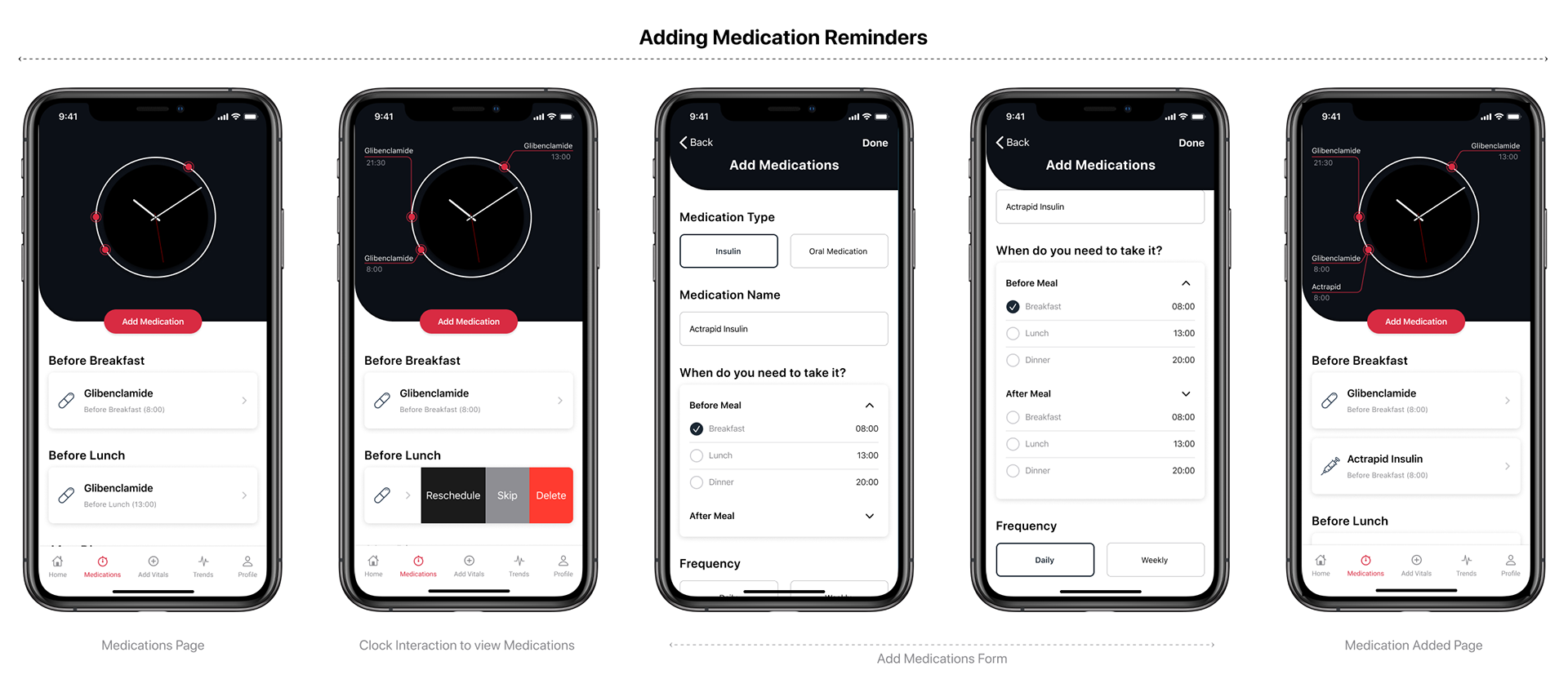
Adding Medication Reminders: The medications page gives users an overview of all their medications, segregated by time. Users can also add new medication reminders by tapping the "Add Medication" button which will redirect them to a form. Here, the users can choose the type of medication and set reminders based on the time and frequency of consumption required. The clock in the page is also interactive, giving an overview of all the medications to be taken. The medication cards follow the iOS pattern of swiping to find additional tools.
Since in the usability testing, one of the concerns was that users may turn off the reminder but not actually take the medication, I came up with the solution wherein the app would notify the user 5 minutes after the reminder has been marked as "done" to confirm that the user actually took the medicine.
Since in the usability testing, one of the concerns was that users may turn off the reminder but not actually take the medication, I came up with the solution wherein the app would notify the user 5 minutes after the reminder has been marked as "done" to confirm that the user actually took the medicine.
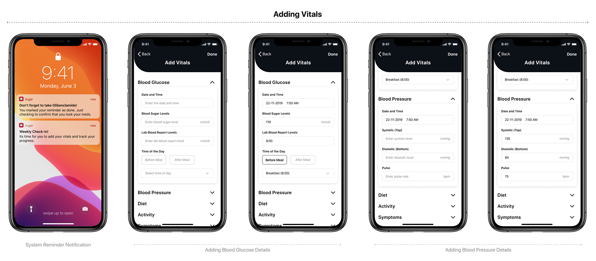
Adding Vitals: For the progress tracking to work efficiently, the users are required to track their vitals at least once every 2 weeks. The app sends users a notification reminding the user to check-in on their progress. Tapping this reminder takes them directly to the 'Add Vitals' page where users can input their vitals for blood glucose, blood pressure and other aspects. This helps them remain consistent and actively progress towards their goals.
High-fidelity Prototype
Next Steps
The positive outcome from the user testing proved that the features were well received and needed. Users confirmed that celebrating small victories is the way to make progress in your condition as a diabetic. Since diet and exercise are 2 other important factors that enable diabetics to improve their condition, I intend to work on creating the flows for these 2 aspects in my next step for the project.