
Client | Kaus Insurance
Role | UX/UI Designer
Duration | 7 Weeks
Tools Used | Sketch, Illustrator, Photoshop, Marvel
Role | UX/UI Designer
Duration | 7 Weeks
Tools Used | Sketch, Illustrator, Photoshop, Marvel
Where did we come from?
Kaus is a very big insurance company. They have insurance for every type of situation. The focus on this project is on insurance policies for individuals, but they also cover businesses. They have 350+ separate offerings. Instead of fully customised options, they sell prepared packages.
What if buying insurance was as easy as buying clothes?
Streamlined. Seamless. Accessible. Modern. Simple. Secure
Up until now, Kaus has been working through regional agents, selling the policies to them instead of directly to customers. This makes the process arduous and boring. We wanted to change the face of the online insurance industry.
I have tried to achieve these attributes in the final product for Kaus Insurance. By keeping the main target group in mind, I have tried to promote the importance of finding the right insurance policies through the values of transparency and accessibility.
The Challenge
How do we attract a younger audience to buy insurance?
Modern digital age has helped bring accessibility to many different sectors and it was important to explore how insurance transactions could be made more accessible and digital for the younger audience
Modern digital age has helped bring accessibility to many different sectors and it was important to explore how insurance transactions could be made more accessible and digital for the younger audience
Stage 1 | Empathise
Secondary Research | Learning the ins and outs of Insurance
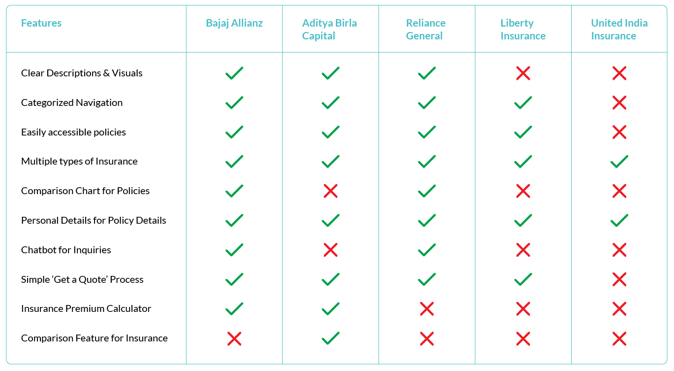
I started by outlining a research plan. Then, through articles, infographics, reports and statistics, I explored the various types of insurance available and which are the most popular ones. I also found quantitative data to support that certain types of insurance are bought by a certain group of people based on age, income etc. This will help me outline the filters and grouping methods that can be used within the site. I started the research ramp up through Competitor Analysis and then compiled the findings into a Competitor Feature Matrix to have an overview of the market research.
Primary Research | Learning from the users themselves
The empathy research involving interviews helped me understand the type of insurance sought out by certain similar users and how the target users can be grouped. It also helped provide insight into how marketing helps clients make their decisions.
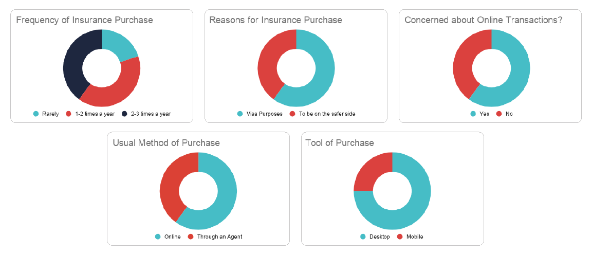
The interview involved 5 users within the target group age of 18-40. The findings from the same were compiled into a comparative table. These interviews helped provide insight into the reasons why users avoid online insurance transactions and how this issue could be solved.
Below you can find the summarised findings from the empathy research.
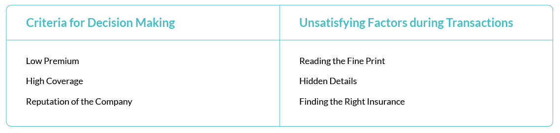
Crucial Findings
Stage 2 | Define
Outlining the Target Group | Creation of User Personas and Empathy Maps
The interviews helped me understand potential users and enabled me to outline user personas and empathy maps that helped guide me in the design process. These personas symbolise the target groups and helped me maintain direction in my process. The creation of empathy maps for these personas helped identify pain points and in empathising with potential users.
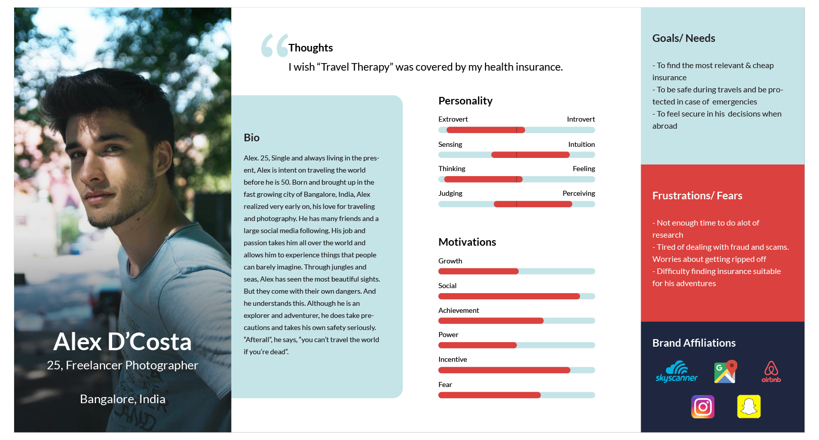
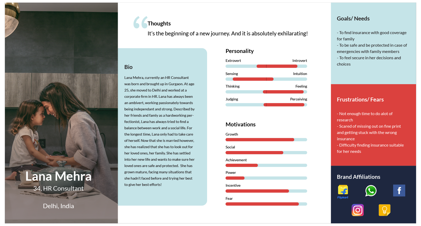

The Story of a User's Woe
Defining Project Goals | Finding the balance
The empathise stage helped provide the framework to define the project goals which helped strike a balance between business, user and technical goals. This step brought clarity in the design process and helped connect the research to the process of design.

Product Feature Roadmap
Upon defining the project goals and based on the empathy research, the Product Feature Roadmap was defined. This helped in prioritising the various features involved within the product into different versions so as to have a more disciplined workflow in order to achieve a productive MVP.
Information Architecture
Before diving into defining the architecture of the website, a card sorting study was conducted in order to understand grouping of categories from a user perspective. This involved a set of 24 cards each named after a different type of insurance. Users were asked to group the cards based on any logical understanding and the findings for the same were compiled into a Card Sorting Summary which helped define the final categories within the website.
From this point, a sitemap, task flow and user flow was created. The sitemap includes the many different features involved in the site. The task flow outlines one task and what the user sees and does. Similarly, the user flow outlines 2 tasks that the user can accomplish and this provided the base for the design process.
In addition to this, a Product Requirements Chart was created to outline the features necessary to complete the tasks assigned.
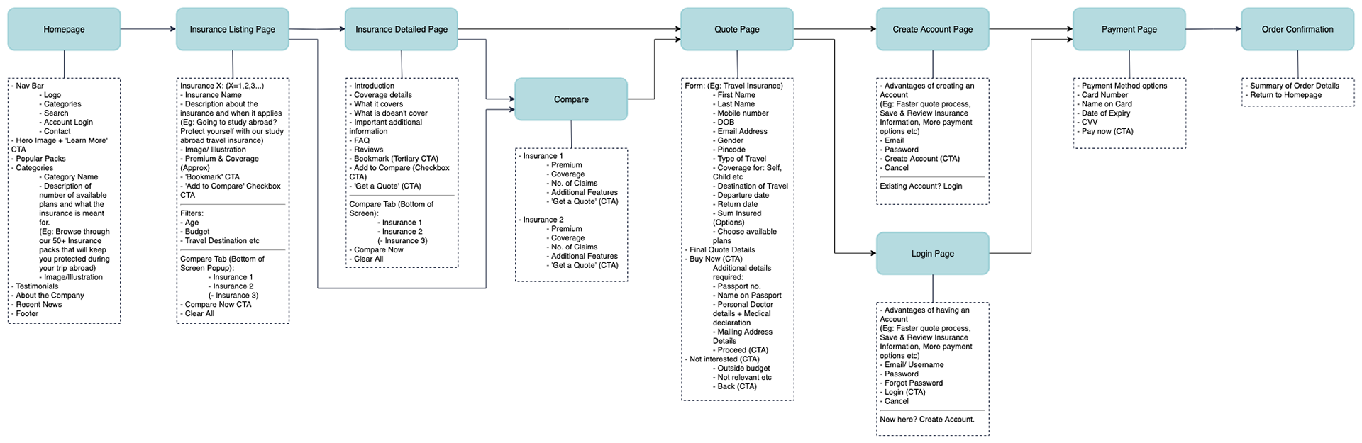
Sitemap
Stage 3 | Ideate
Wireframes
The ideate stage started with sketching out ideas and wireframes based on the findings from the research and define stages. Sketching helped in quick explorations of multiple different design solutions for the various pages involved.
Once the basic wireframes were laid out through sketching, these were converted into low fidelity wireframes where focus was given on functionality and overall layout of the pages. Low fidelity responsive wireframes were created as well.
Once the basic wireframes were laid out through sketching, these were converted into low fidelity wireframes where focus was given on functionality and overall layout of the pages. Low fidelity responsive wireframes were created as well.
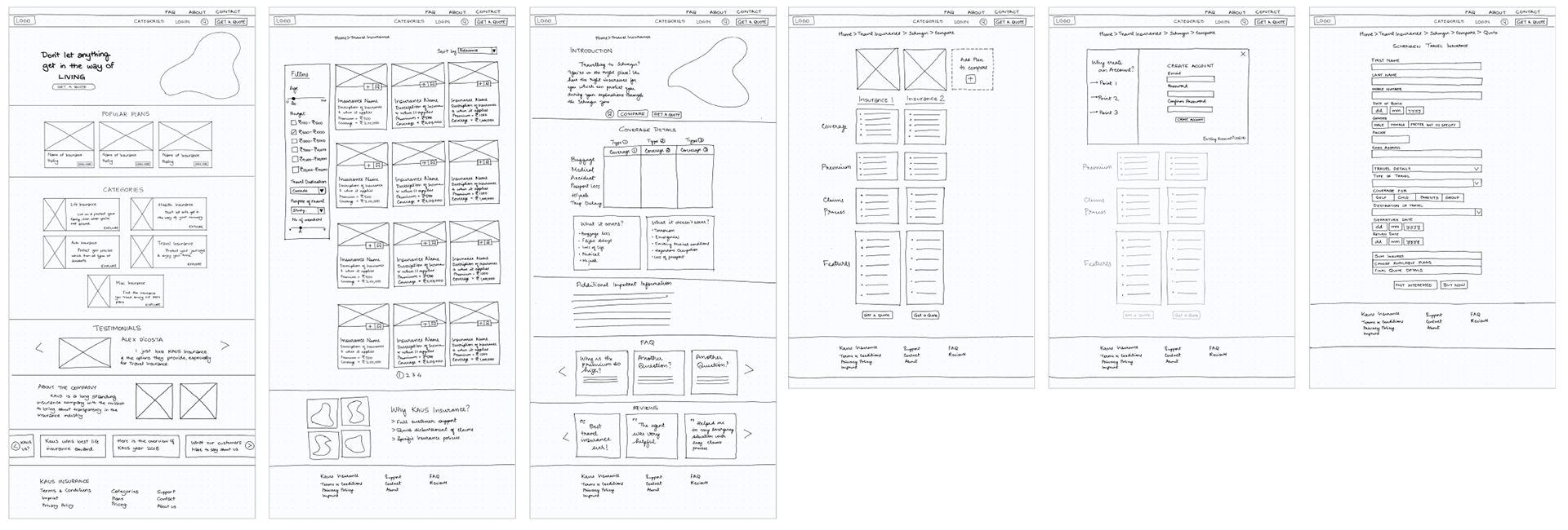
From left to right: Homepage | Insurance Listing Page | Insurance Detailed Page | Comparison Page | Creation of Account | Quote Process Page
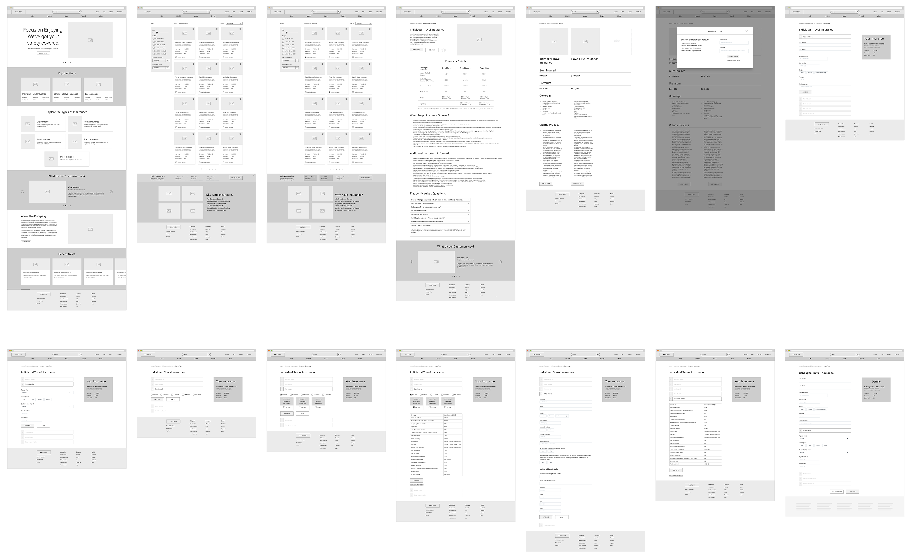
Low-Fidelity Wireframes
Branding
The branding process started with defining the brand attributes and logo explorations. The logo was then selected and refined on Illustrator to create the final version of the Logo.
Following this, a brand style tile was created wherein the colour palette, with a sea green as the main brand colour was created. This was due to the fact that I wanted to create a calming, trustworthy brand that champions transparency and reliability. Typography, Logo styles, UI Elements and Imagery was also defined in the Style Tile. The responsive pages were then refined using the styling to create mid-fidelity wireframes to ensure that the branding worked as planned.
A UI Kit, was also created as an extension of the style tile to ensure consistency and seamlessness in the overall UI of the website and to ensure a smooth Handoff.

Stage 4 | Prototyping
High-Fidelity Wireframes and Prototyping
The Kaus Branding was used to complete the high fidelity wireframes. These wireframes were designed so as to enable the completion of 2 main flows:
1) To 'Get a Quote' and purchase an insurance policy
2) To Compare 2 insurance policies
1) To 'Get a Quote' and purchase an insurance policy
2) To Compare 2 insurance policies
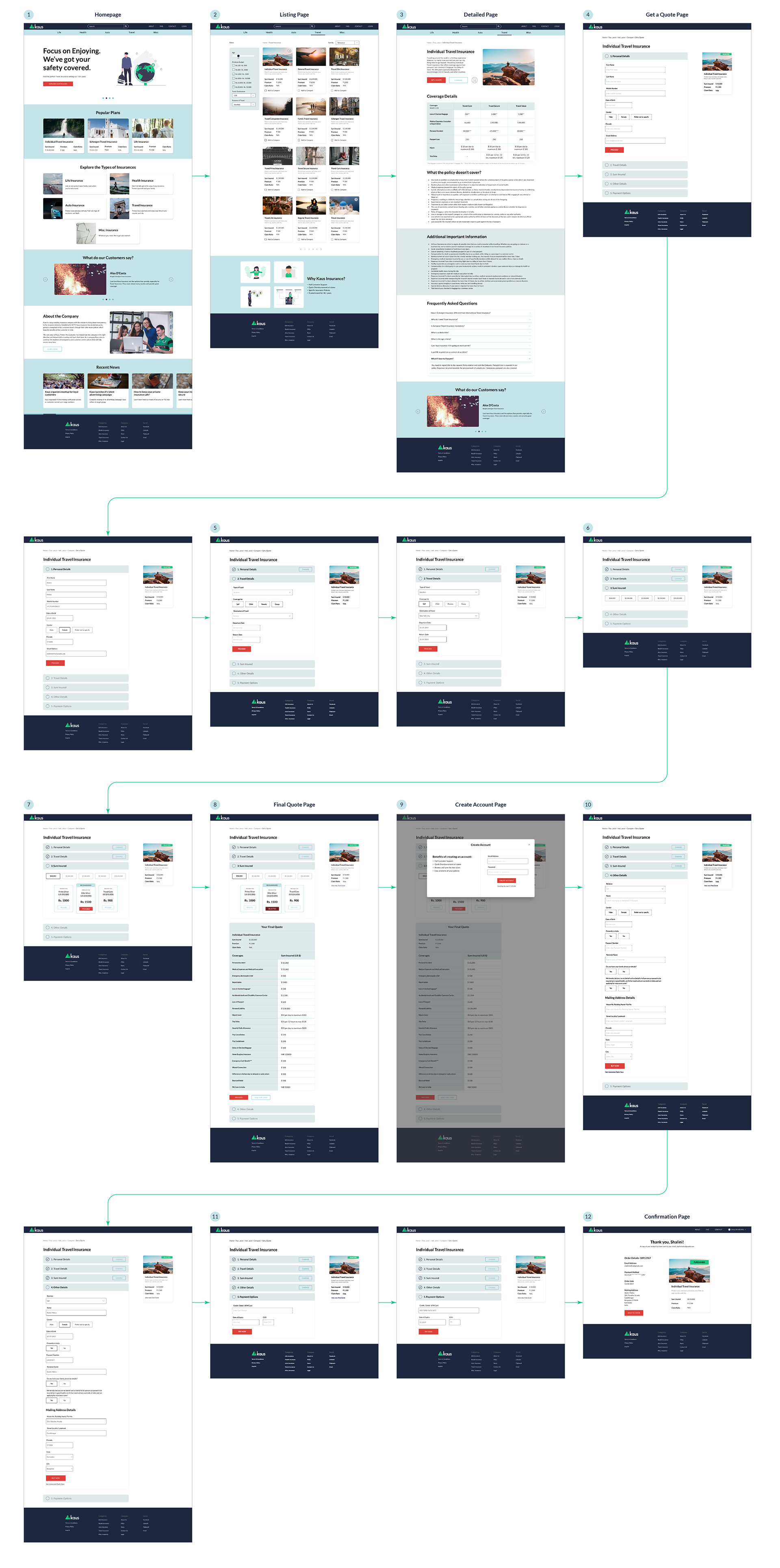
Flow 1: "Get a Quote" and Purchase of Insurance Policy
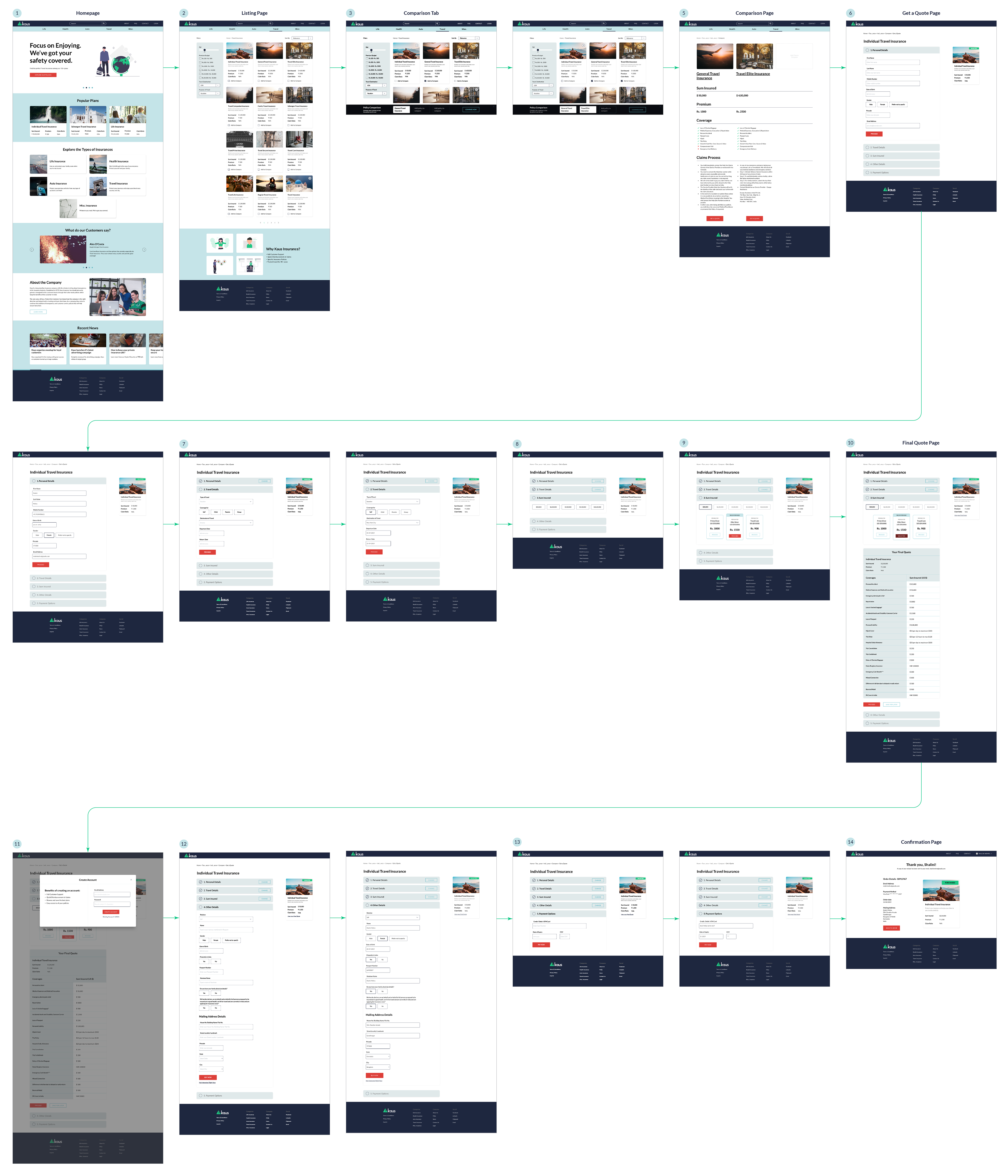
Flow 2: Comparison and Purchase of Insurance Policy
Stage 5 | Testing
Usability Testing and Findings
Upon completion of the prototype, the design was tested on potential users and the findings for the same compiled in a Usability Testing Summary. The findings were then grouped into an Affinity Map to determine the high level changes required and accordingly the changes were made.
Next Steps
Iterations and re-testing will be required for outlining the other user flows within this project. The above process will have to be repeated to include the different user flows in the vast field of insurance transactions and the design will be refined accordingly.