

Client | The Council of Architecture-India (Unsolicited)
Role | UX/UI Designer
Duration | 7 Weeks
Tools Used | Sketch, Illustrator, Photoshop, Marvel
Role | UX/UI Designer
Duration | 7 Weeks
Tools Used | Sketch, Illustrator, Photoshop, Marvel
First, Let's start with the Big Reveal!
So. What is the Council of Architecture?
The Council of Architecture (COA) is a body that has been constituted by the Government of India. The Council of Architecture is charged with the responsibility to regulate the education and practice of architectural profession throughout India besides maintaining the register of architects.
The Council of Architecture (COA) is the central system which connects all the Architects, Architecture students, Aspiring Architects and anyone associated with the construction industry. They are responsible for ensuring safe Architectural Practices throughout the country.
The Council of Architecture (COA) is the central system which connects all the Architects, Architecture students, Aspiring Architects and anyone associated with the construction industry. They are responsible for ensuring safe Architectural Practices throughout the country.
What does this have to do with their website?

Visit the website at https://www.coa.gov.in/
The COA website is the one-stop-spot for Architects all over India. Every student that has completed their Bachelor in Architecture or any Architect that wishes to practice Architecture in India is required to register themselves in the COA database and receive their license to practice.
The current registration process is partially both online and offline. Architects/Aspiring Architects are required to register themselves on the COA website which is the only means to register, apart from visiting their office in New Delhi. In addition to the registration process, the website handles many other aspects such as News & Updates, Updates regarding certain laws, database of all the members, publications etc.
The current registration process is partially both online and offline. Architects/Aspiring Architects are required to register themselves on the COA website which is the only means to register, apart from visiting their office in New Delhi. In addition to the registration process, the website handles many other aspects such as News & Updates, Updates regarding certain laws, database of all the members, publications etc.
What urged the unsolicited redesign?
My background as an Architecture graduate and prior experience with the website urged me to have another look into the user experience of the website.
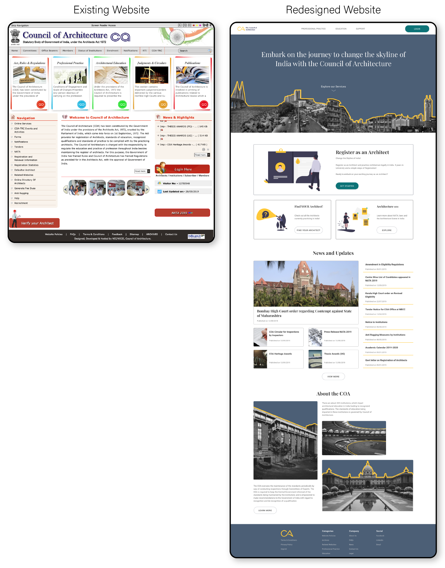
The current website for the COA, is a non-responsive website that is difficult to navigate. With rapid digitisation of major industries within India, COA too, has tried to digitise various processes such as Architect Registration, Firm Registration etc. However, since new features are being introduced on a weak base, the user base for the same is very limited. Users commonly find many issues in basic functionality within the website and are seen turning to Google and Quora in order to understand the proceedings.
As a primarily user oriented website and an important website for architects in India, it is important to have a solid user experience driven website wherein these features can be easily used which helps in streamlining the process from both user and the councils ends.
To avoid my personal biases, I conducted a background study and Heuristic Evaluation of the website.
Stage 1 | Understanding the Existing Website
Background Research | Learning about the purpose of the website
Upon detailing the research plan, I started by looking into the current statistics of the existing website. Understanding more about the site traffic and the potential user base was helpful in defining the project brief.
I observed that the website has around 50,000-90,000 users per month. However the low average visit duration showed that users bounced off the website, possibly without completing their required tasks. The study also showed that most users visited the site through direct search rather than being redirected to the site.
I observed that the website has around 50,000-90,000 users per month. However the low average visit duration showed that users bounced off the website, possibly without completing their required tasks. The study also showed that most users visited the site through direct search rather than being redirected to the site.

Website traffic details acquired from https://www.similarweb.com/website/coa.gov.in
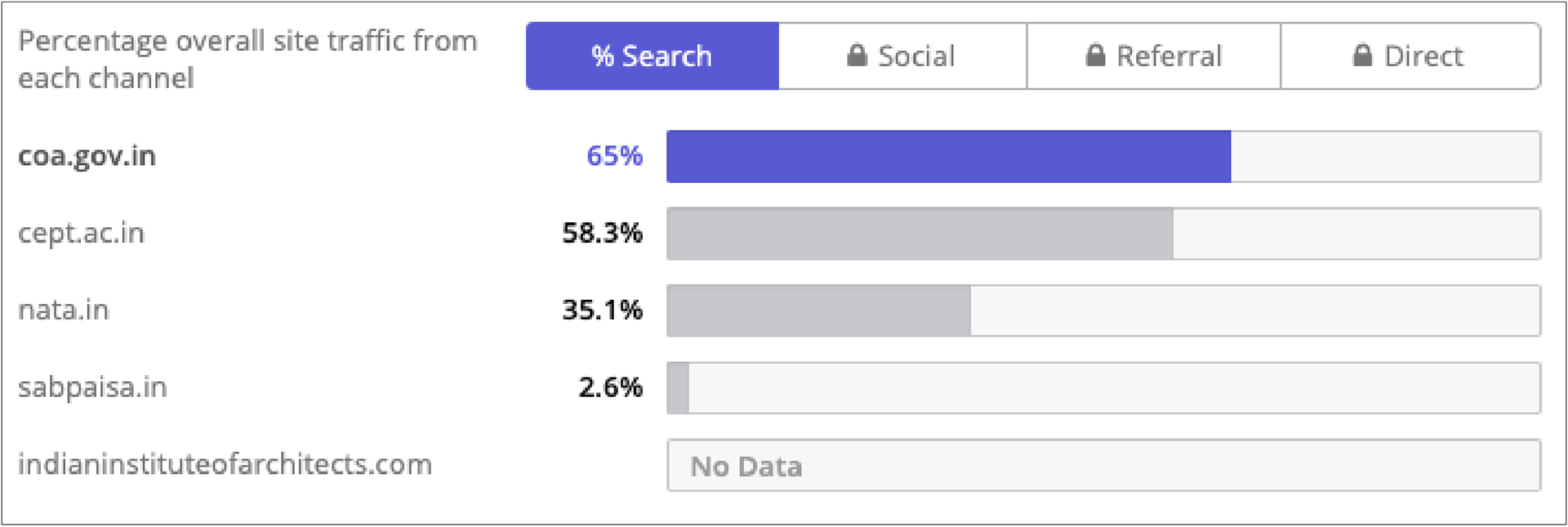
Site traffic data acquired from https://www.alexa.com/siteinfo/coa.gov.in
Heuristic Evaluation | Evaluating the Current Website
It was important to understand the existing website of the COA and determine all the various features included. A complete Heuristic Evaluation was conducted to identify pain points which then helped outline questions for the questionnaire and in determining main project goals and features required.

Primary Research | Learning from the users themselves
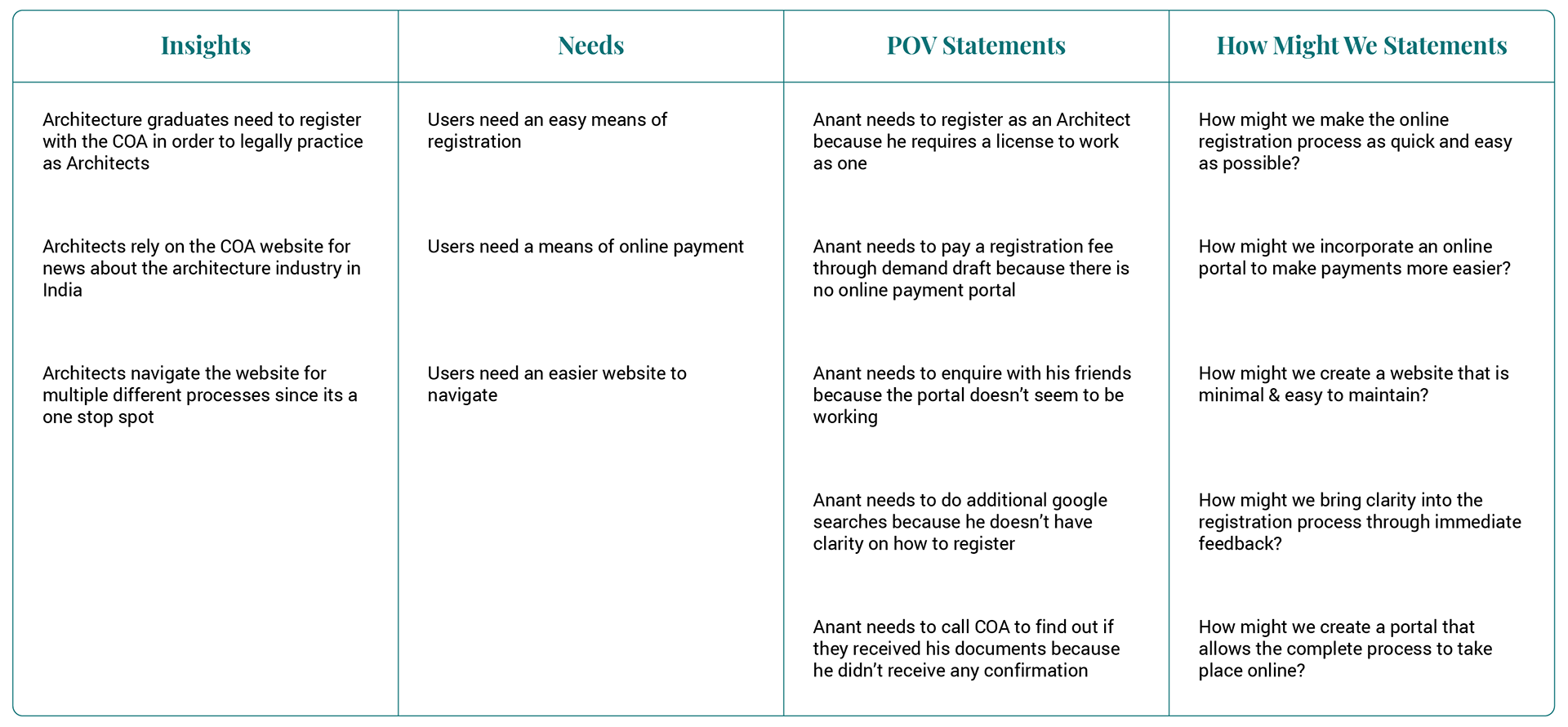
Through an online questionnaire, I got an insight into the major user base for the website and the main user flows within the site. The findings allowed me to outline the main use of the site, the problem points from the user perspective and to get firsthand feedback about the existing site. The users had very specific issues they faced in the website.

Crucial Findings | POV and How Might We Statements
Stage 2 | Outlining the Necessities
Outlining the Target Group | Creation of User Personas and Empathy Maps
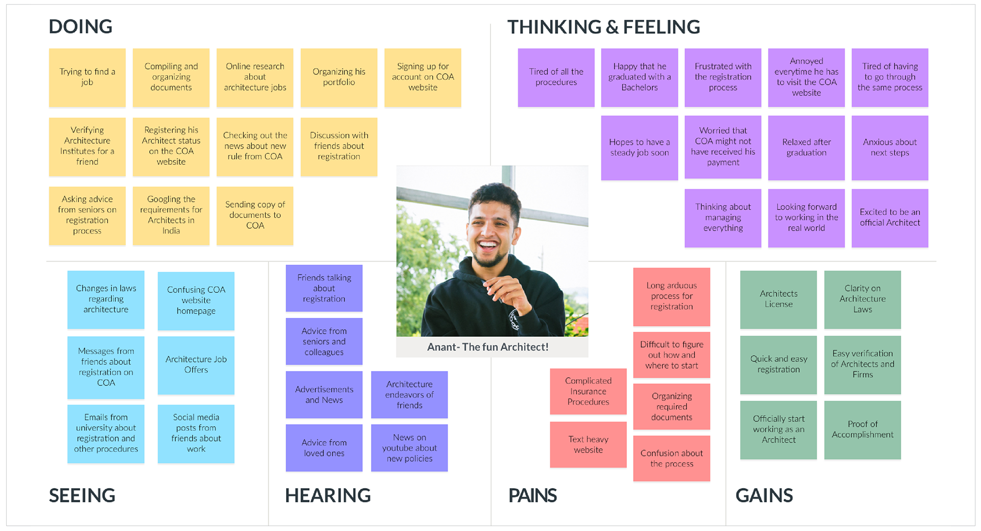
The questionnaire helped me understand potential users and enabled me to outline user personas and empathy maps that helped guide me in the design process. This persona symbolises the primary target group and helped me maintain direction in my process. The creation of empathy map for the persona helped identify pain points and in empathising with potential users.

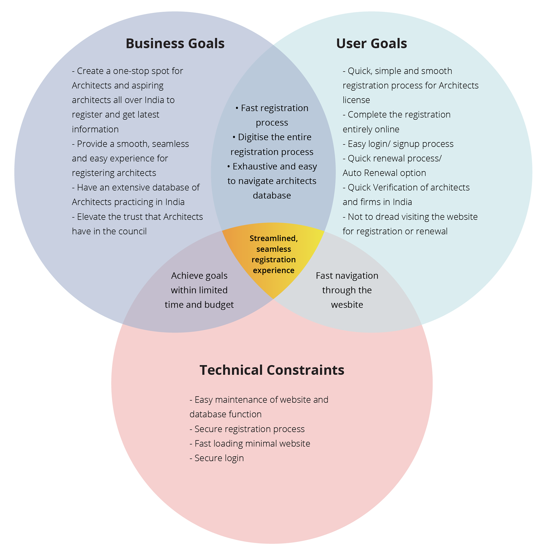
Defining Project Goals | Finding the Best Solution
The empathise stage helped provide the framework to define the project goals which helped strike a balance between business, user and technical goals. This step brought clarity in the design process and helped connect the research to the process of design. On defining the project goals, I prioritised the various features required in the product and worked out the features necessary for an MVP in a Product Feature Roadmap
Information Architecture
Based on the background research and Heuristic Evaluation, the Information Architecture of the current website was assessed and each category was grouped accordingly. Based on this, the Information Architecture was redefined for the redesign. The new IA aims to categorise all the data within the site and to minimise the cognitive overload in the homepage.
In addition to this, a Product Requirements Chart was created to outline the features necessary to complete the tasks assigned.
In addition to this, a Product Requirements Chart was created to outline the features necessary to complete the tasks assigned.
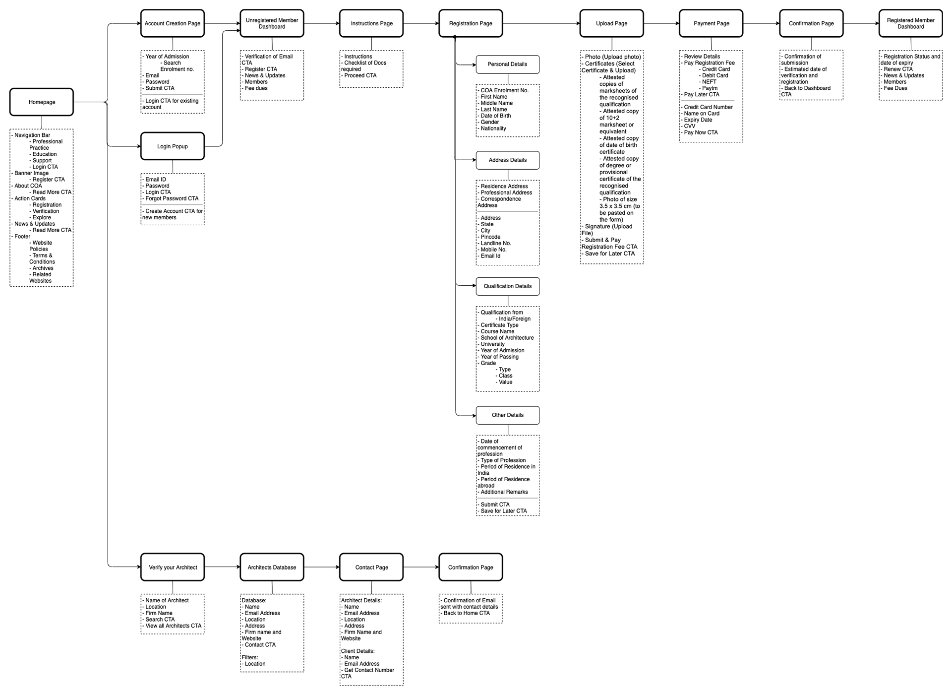
Redesigned Sitemap
Stage 3 | Starting at the Drawing Board
Wireframes
The ideate stage started with sketching out ideas and wireframes based on the findings from the research and define stages. Sketching helped in quick explorations of multiple different design solutions for the various pages involved. My biggest goal was to try and achieve a minimal, clear design and flow within the website which would be in contrast with the current site.
Once the basic wireframes were laid out through sketching, these were converted into low fidelity responsive wireframes where focus was given on functionality and overall layout of the pages.
Once the basic wireframes were laid out through sketching, these were converted into low fidelity responsive wireframes where focus was given on functionality and overall layout of the pages.
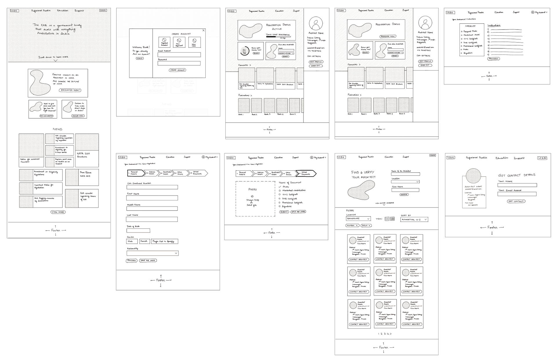
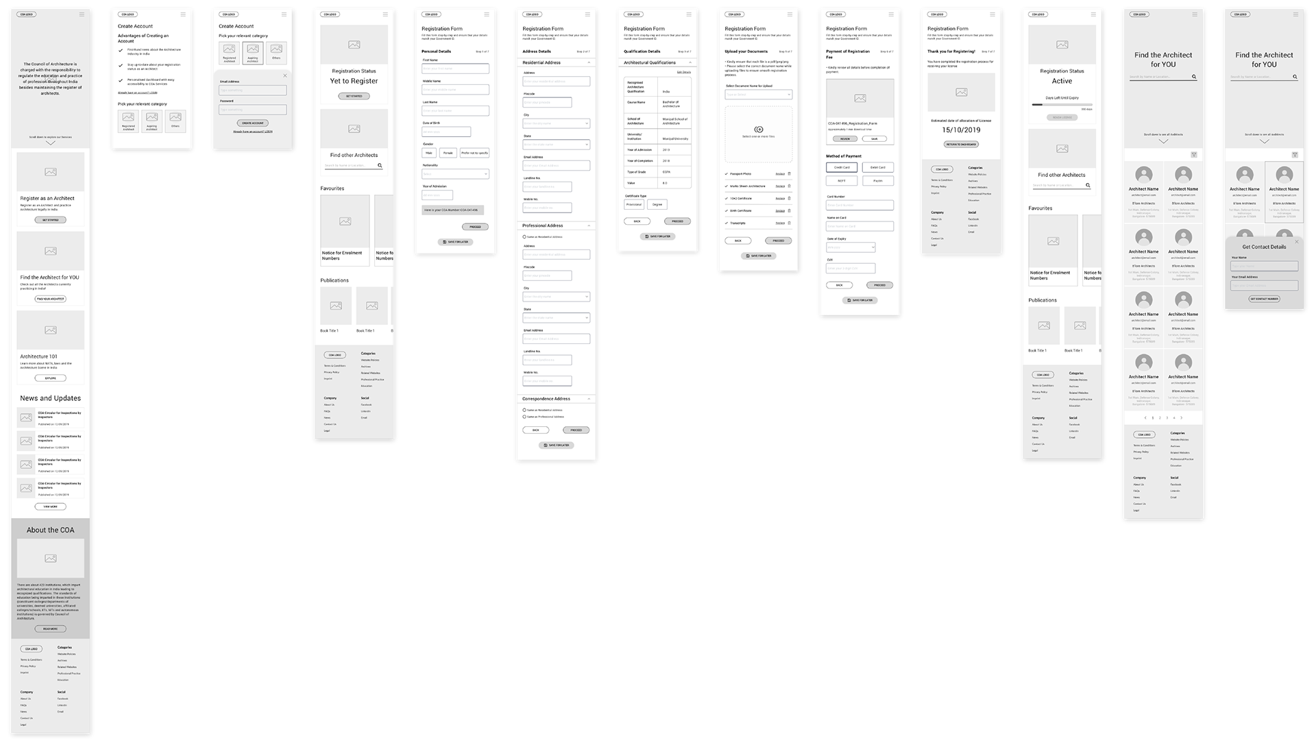
From left to right: Homepage | Create Account | Registered Member Dashboard | Unregistered Member Dashboard | Instructions
Registration Process Form | Upload Documents Page | Find Architect Page | Get Architects Contact Details
Rebranding
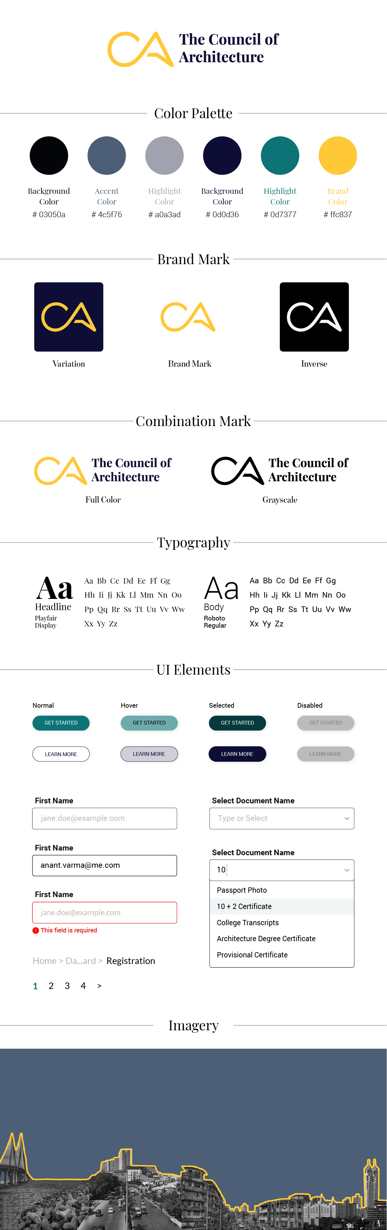
The rebranding process started with defining the brand attributes and logo explorations. The logo was created to bring about creativity along with a sense of sophistication in the branding.
Following this, a brand style tile was created wherein the colour palette, with a sunny yellow as the main brand colour. Since the current brand isn't strong and is chaotic, I wanted to redefine it in a manner which would stand out. Minimalism, Creativity and Clarity were the main brand attributes. Typography, Logo styles, UI Elements and Imagery have also been defined in the Style Tile.
Following this, a brand style tile was created wherein the colour palette, with a sunny yellow as the main brand colour. Since the current brand isn't strong and is chaotic, I wanted to redefine it in a manner which would stand out. Minimalism, Creativity and Clarity were the main brand attributes. Typography, Logo styles, UI Elements and Imagery have also been defined in the Style Tile.
Stage 4 | Creating the Final Designs
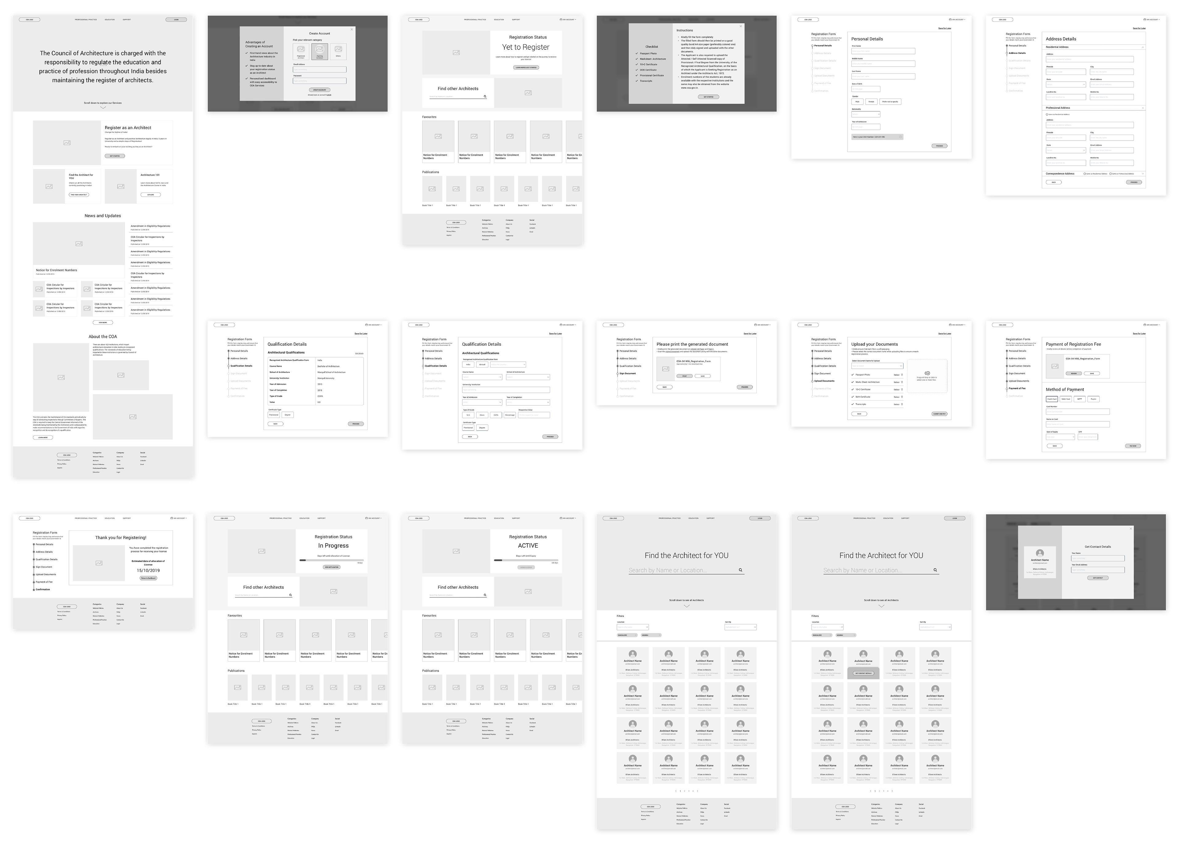
High-Fidelity Wireframes and Prototyping
The redefined COA branding was used to create the high fidelity wireframes. These wireframes were designed so as to enable the completion of 2 main flows:
1) To register as an Architect
2) To find a particular Architect and get their contact details.
1) To register as an Architect
2) To find a particular Architect and get their contact details.
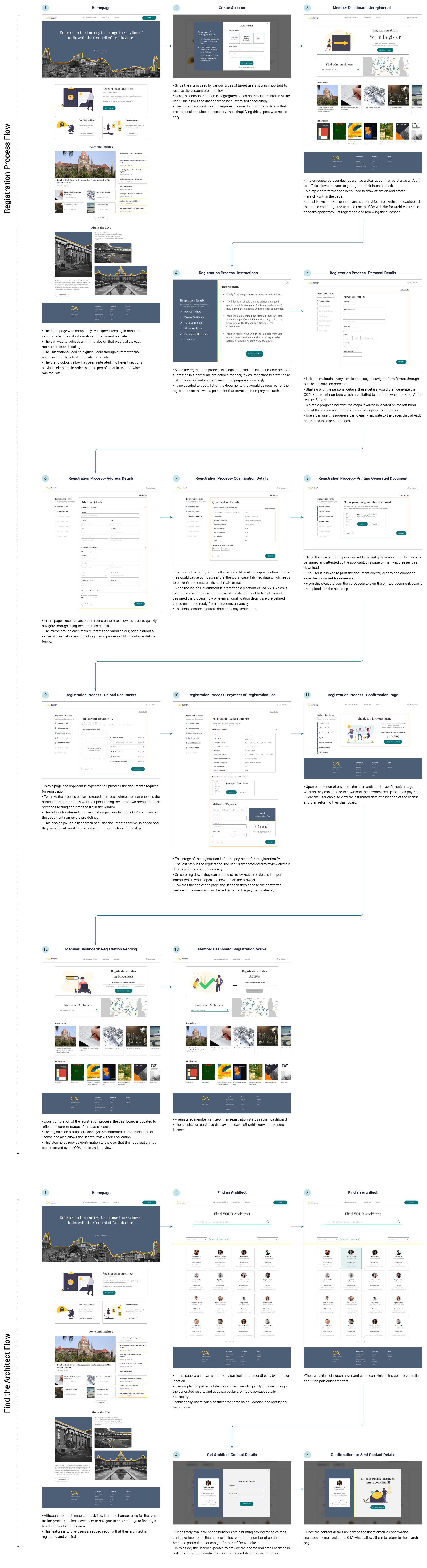
Desktop Site: Registration Flow and Finding Architect Flow
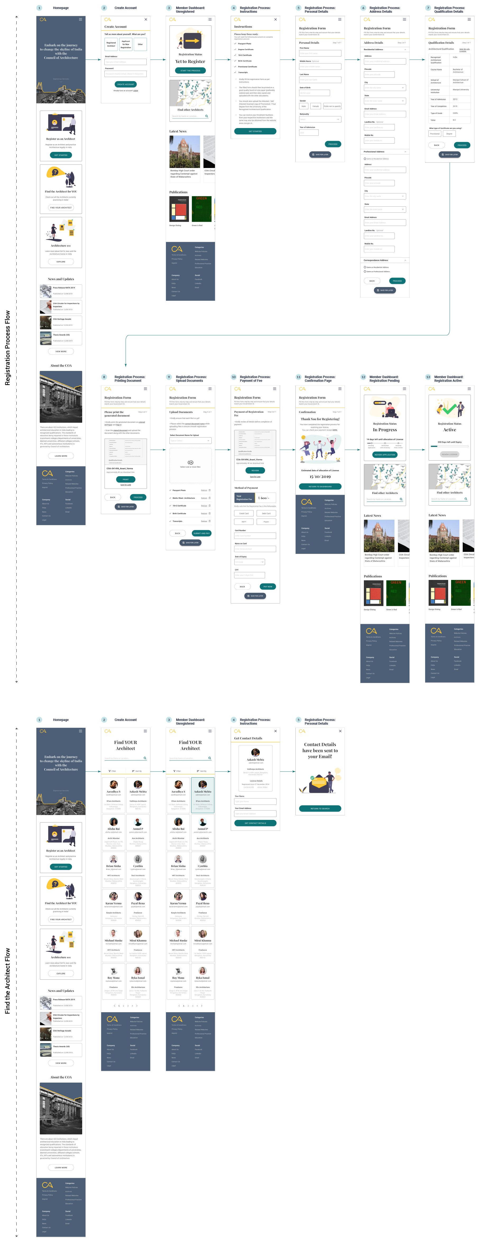
Mobile Site: Registration Flow and Finding Architect Flow
Stage 5 | Testing the Redesign
Usability Testing and Findings
Upon completion of the prototype, the design was tested on potential users and the findings for the same compiled in a Usability Testing Summary. The findings were then analysed and the high priority revisions were determined. Accordingly, these changes were made and updates in the high fidelity wireframes and prototypes.
And finally, Here are the Results!

Next Steps
Since this project is a project that holds a lot of value to me and is something associated with my background as an Architect, I intend to continue working on the other flows within the project. Iterations and re-testing will be required for outlining the other user flows. And based on feedback and testing, I intend to refine the project and achieve an end to end product.